The React UI library for ChatGPT Apps SDK
Production-ready components, hooks, and design system to build beautiful ChatGPT Apps 10x faster. OpenAI Figma-aligned, fully typed, and accessible.


🎪 Live Storybook · ⚡ Quick Start · 🧪 Examples · 🧱 Components
AI Native Kit UI bridges the gap between structured MCP JSON and beautiful, accessible UI for ChatGPT apps. Designed for the Apps SDK, it maps model/tool results directly to interactive, Figma‑aligned components, so you stop hand‑wiring UI and start shipping.
- ✨ What you get: Production‑ready React components, example patterns, hooks for Apps SDK, and a rich design‑token system.
- 🧭 Who it's for: Developers building ChatGPT Apps who want consistent, on‑brand UI without reinventing the wheel.
Why now? ChatGPT Apps (via the Apps SDK) expose results + UI metadata. This kit renders those results as native widgets with minimal code.
You should use AINativeKit if you're:
- ✅ Building ChatGPT Apps with the Apps SDK
- ✅ Converting MCP/tool JSON outputs into user interfaces
- ✅ Want production-ready components instead of building from scratch
- ✅ Need OpenAI Figma design consistency out-of-the-box
- ✅ Value TypeScript, accessibility, and developer experience
| Developer Pain Point | How AINativeKit UI Helps |
|---|---|
| Manually converting JSON to UI | Native JSON -> UI mapping components streamline integration |
| Lack of ChatGPT‑specific components | Built specifically for the ChatGPT Apps SDK with optimized patterns |
| Inconsistent design & icons | Figma‑aligned tokens + typed icon library ensure visual consistency |
| Accessibility concerns | WCAG 2.1 AA mindful components with ARIA support |
| Poor developer experience | 100% TypeScript, IntelliSense, Storybook docs |
| What You'd Usually Do | With AINativeKit |
|---|---|
| ❌ Hand-wire 50+ lines of JSX per card | ✅ <SummaryCard {...data} /> |
| ❌ Search for Figma design specs | ✅ Figma-aligned tokens included |
| ❌ Build icons from scratch | ✅ 417 OpenAI typed icons ready |
| ❌ Set up dark mode manually | ✅ Automatic theme detection |
| ❌ Write custom hooks for SDK | ✅ useOpenAiGlobal() hooks included |
| ❌ Test accessibility yourself | ✅ WCAG 2.1 AA tested |
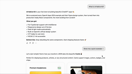
Bottom line: Ship features, not infrastructure.
- 🎯 Apps SDK Optimized: Components designed to work seamlessly with ChatGPT Apps SDK
- 🔄 JSON -> UI Mapping: Render structured MCP results with minimal glue code
- 🤖 AI-Tool Friendly: JSON schemas, component registry, and utilities for AI code generation
- 🎨 417 Figma‑Aligned Icons: Fully typed and tree‑shakeable
- ♿ Accessibility First: ARIA attributes & sensible focus management
- 🌗 Dark/Light Themes: Built‑in theme switching
- 🧩 Production‑Ready Blocks: Cards, lists, carousel, album, map, and more
- 🪝 OpenAI Hooks:
useOpenAiGlobal,useWidgetState,useMaxHeight - 📦 Tree‑Shakeable & Type‑Safe: Import only what you need
npm install @ainativekit/ui
# or
pnpm add @ainativekit/ui
# or
yarn add @ainativekit/uiimport { SummaryCard } from '@ainativekit/ui';
import '@ainativekit/ui/styles';
// Example MCP/tool JSON from your backend
const restaurantData = {
title: "Little Nona's",
subtitle: '1427 Via Campania',
rating: '9.2',
description:
'A tiny, brick-walled trattoria tucked down a side street. The windows glow warm gold at night.',
images: [
// Display up to 4 images
{ src: 'https://images.unsplash.com/photo-1513104890138-7c749659a591?w=400', alt: 'Pizza' },
{ src: 'https://images.unsplash.com/photo-1621996346565-e3dbc646d9a9?w=400', alt: 'Pasta' },
{ src: 'https://images.unsplash.com/photo-1512621776951-a57141f2eefd?w=400', alt: 'Salad' },
],
};
export function RestaurantListing() {
return (
<SummaryCard
images={restaurantData.images}
title={restaurantData.title}
subtitle={restaurantData.subtitle}
badge={restaurantData.rating}
badgeVariant="success"
description={restaurantData.description}
buttonText="Add to Order"
onButtonClick={() => navigate(`/restaurant/${restaurantData.id}`)}
/>
);
}import { Card, Features } from '@ainativekit/ui';
import '@ainativekit/ui/styles';
export function DocumentCard() {
return (
<Card elevationLevel={1} interactive>
<Card.Header>
<Card.ChipGroup>
<Card.Chip variant="neutral" size="sm">
AINativeKit UI
</Card.Chip>
<Card.Chip variant="neutral" size="sm">
Guide
</Card.Chip>
</Card.ChipGroup>
</Card.Header>
<Card.Image
src="https://images.unsplash.com/photo-1499750310107-5fef28a66643?w=400&h=200&fit=crop"
alt="AINativeKit UI library documentation"
/>
<Card.Body>
<Card.Title as="h3">Building AI-Native UIs</Card.Title>
<Card.Description>
Build modern, accessible UI with AINativeKit. Master reusable component patterns that
scale.
</Card.Description>
<Card.Meta>
<Features
items={[
{ icon: 'clock', label: '10 min read' },
{ icon: 'calendar-today', label: 'October 30, 2025' },
]}
iconSize={12}
/>
</Card.Meta>
</Card.Body>
<Card.Footer>
<Card.Actions align="start">
<Card.ActionButton variant="primary">Explore Docs</Card.ActionButton>
</Card.Actions>
</Card.Footer>
</Card>
);
}📚 Explore many more examples in Storybook -> https://www.ainativekit.com
- Cards: Image, summary, list, discovery
- Lists: Structured lists with rich content
- Carousel: Horizontal scroll galleries
- Album: Media gallery with fullscreen
- Map: Location UI pattern with fullscreen
Tip: Copy any example from Storybook into your app and tweak the props.
Core: Button (primary/secondary/tertiary/ghost) · Icon · Badge · Chip · Alert · Skeleton · Card
Patterns: Card variants · Carousel · List · Album · Map
Use consistent colors, typography, spacing, and elevation derived from OpenAI's Figma system.
import { colors, typography, spacing, elevation } from '@ainativekit/ui';

const style = {
  backgroundColor: colors.light.background.primary,
  padding: spacing[16],
  fontSize: typography.body.fontSize,
  boxShadow: elevation[1].shadow,
};
Icons:
import { Icon } from '@ainativekit/ui';
import { SettingsCog, Terminal, Star } from '@ainativekit/ui/icons';

// Preferred: Named icon components
<SettingsCog size="md" />

// Alternative: Dynamic icon by name
<Icon name="settings-cog" size="lg" />Utilities to integrate with the ChatGPT Apps SDK runtime.
import {
  useOpenAiGlobal,
  useWidgetState,
  useMaxHeight,
  useTheme,
  useDisplayMode,
} from '@ainativekit/ui';

function MyChatGPTWidget() {
  // Get theme (read-only in ChatGPT, controllable with ThemeProvider)
  const { theme, isControlledByChatGPT } = useTheme();

  // Access other OpenAI global values (reactive)
  const displayMode = useDisplayMode(); // 'inline' | 'pip' | 'fullscreen' | null
  const maxHeight = useMaxHeight(); // number | null

  // Or access any global property directly
  const locale = useOpenAiGlobal('locale'); // string | null

  // Manage persistent widget state
  const [state, setState] = useWidgetState({ count: 0 });

  return (
    <div
      className={theme === 'dark' ? 'dark-mode' : 'light-mode'}
      style={{ maxHeight: maxHeight ?? 600 }}
    >
      {/* your widget */}
    </div>
  );
}
Available Hooks:
useTheme()- Get current theme and optionally control it (see ThemeProvider below)useDisplayMode()- Get current display mode (inline/pip/fullscreen)useMaxHeight()- Get maximum height constraint for layoutuseWidgetState(defaultState)- Persistent state across ChatGPT sessionsuseOpenAiGlobal(key)- Access anywindow.openaiproperty reactivelyuseWidgetProps(defaultProps)- Get tool output data
For development and standalone apps, use ThemeProvider to enable programmatic theme control:
import { ThemeProvider, useTheme } from '@ainativekit/ui';

function App() {
  return (
    <ThemeProvider defaultTheme="light">
      <MyApp />
    </ThemeProvider>
  );
}

function MyApp() {
  const { theme, setTheme, isControlledByChatGPT } = useTheme();

  return (
    <div>
      <p>Current theme: {theme}</p>
      <button
        onClick={() => setTheme?.(theme === 'light' ? 'dark' : 'light')}
        disabled={isControlledByChatGPT}
      >
        Toggle theme
      </button>
      {isControlledByChatGPT && <p>Theme is controlled by ChatGPT</p>}
    </div>
  );
}
Theme Behavior:
- Inside ChatGPT: Theme is read-only (
window.openai.theme),setThemehas no effect - Inside ThemeProvider: Theme is controllable, persists to localStorage
- Standalone: Theme defaults to system preference or specified default
ThemeProvider Props:
defaultTheme- Initial theme ('light' or 'dark'), default: 'light'storageKey- LocalStorage key for persistence, default: 'ainativekit-theme'enableSystemTheme- Detect system preference, default: truebrandColors- Custom brand color overrides (see Brand Color Customization below)
Override default brand colors to match your app's identity. Brand colors support both simple strings and light/dark mode variants:
import { ThemeProvider } from '@ainativekit/ui';

function App() {
  return (
    <ThemeProvider
      defaultTheme="light"
      brandColors={{
        // Simple: Same color for both light and dark modes
        primary: '#6366F1', // Indigo

        // Light/dark variants: Different colors per mode
        success: { light: '#059669', dark: '#34D399' },
        warning: { light: '#D97706', dark: '#FBBF24' },
        error: { light: '#DC2626', dark: '#F87171' },
      }}
    >
      <MyApp />
    </ThemeProvider>
  );
}
Brand Color Options:
| Color | Purpose |
|---|---|
primary |
Main actions, links, primary buttons |
success |
Positive states, confirmations |
warning |
Caution messages, warnings |
error |
Error states, destructive actions |
Color Value Formats:
- String (e.g.,
'#6366F1'): Same color for both light and dark modes - Object (e.g.,
{ light: '#059669', dark: '#34D399' }): Different colors per mode
The library automatically validates color contrast ratios and warns about potential accessibility issues.
AINativeKit UI exports comprehensive TypeScript definitions for the ChatGPT Apps SDK, giving you full autocomplete and type safety for window.openai.
// Simply import the package
import '@ainativekit/ui';

// window.openai is now fully typed! ✨
const theme = window.openai?.theme; // 'light' | 'dark' | undefined
const toolOutput = window.openai?.toolOutput; // string | undefined
const displayMode = window.openai?.displayMode; // 'inline' | 'pip' | 'fullscreen' | undefined

// Full autocomplete for all methods
window.openai?.sendFollowUpMessage({ prompt: 'Show more' });
const result = await window.openai?.callTool('get_weather', { location: 'SF' });All ChatGPT Apps SDK types are exported:
import type {
  OpenAiGlobals,
  OpenAiApi,
  Theme,
  DisplayMode,
  UserAgent,
  SafeArea,
} from '@ainativekit/ui';

// Use in your own type definitions
type MyWidgetProps = {
  theme: Theme;
  displayMode: DisplayMode;
};
Exported Types:
OpenAiGlobals- Completewindow.openaiglobals interfaceOpenAiApi- API methods (callTool,sendFollowUpMessage, etc.)Theme-'light' | 'dark'DisplayMode-'inline' | 'pip' | 'fullscreen'UserAgent- Device type and capabilitiesSafeArea- Safe area insets for mobile layoutsCallTool- Type-safe tool calling signature- And more... (see types.ts)
AINativeKit UI is optimized for AI coding assistants through Context7 and runtime utilities.
If you use Claude Code, Cursor, or other AI editors with Context7 support:
use context7 @ainativekit/ui
This will inject the latest component documentation directly into your AI's context, enabling:
- Smart component suggestions
- Accurate prop recommendations
- Best practice guidance
- Code generation with examples
Dynamically render components from JSON/API data in your production app:
import { renderComponent, type ComponentConfig } from '@ainativekit/ui';

const config: ComponentConfig = {
  type: 'SummaryCard',
  props: {
    title: "Little Nona's",
    badge: '9.2',
    images: ['https://example.com/restaurant.jpg'],
    buttonText: 'Add to Order',
  },
};

const card = renderComponent(config); // Renders <SummaryCard {...props} />
Runtime Utilities:
- 🔧
renderComponent()- Render from JSON config - ✅
validateComponentConfig()- Validate component configs - 📝
ComponentPropsMap- Type-safe prop definitions
AI Integration:
- 🤖 Context7: Documentation via "use context7" command
- 📚 Schemas: Can be generated with
pnpm --filter @ainativekit/ui generate:schemasfor external tooling (not used in runtime) - 📖 Guide: See
/docsfolder for comprehensive documentation
pnpm install          # install deps
pnpm storybook        # run interactive docs
pnpm test             # run tests
pnpm build            # build the library
pnpm lint             # lint
Package structure
@ainativekit/ui
├── /               # Components, tokens, hooks, utilities
├── /icons          # 417 icons as named React components
├── /tokens         # Design tokens only
└── /styles         # CSS styles

Repository (for documentation & tooling):
├── /docs           # Markdown documentation (Context7)
├── /schemas        # JSON schemas (generated on-demand, not committed)
└── /metadata       # Component registry (dev tooling)
- React ≥ 18
- TypeScript ≥ 5 (recommended)
- ChatGPT Apps SDK (preview)
- Works with modern bundlers (Vite, Next.js, etc.)
- More first‑class MCP JSON -> UI mappers (tables, charts, forms)
- Expanded widget patterns used commonly in ChatGPT apps
- Theming API refinement + tokens export
- Additional a11y audits
Have ideas? Please open an issue or PR!
If AINativeKit saves you time:
- ⭐ Star this repo - Helps other ChatGPT Apps developers discover us
- 🐦 Share on Twitter/X - Spread the word about building ChatGPT Apps faster
- 💬 Join discussions - Share what you're building in GitHub Discussions
- 🤝 Contribute - See
CONTRIBUTING.mdfor guidelines
Every star helps us grow the ChatGPT Apps SDK ecosystem!
- Storybook: https://www.ainativekit.com
- NPM: https://www.npmjs.com/package/@ainativekit/ui
- GitHub: https://github.com/AINativeKit/chatgpt-apps-sdk-ui
- Issues: https://github.com/AINativeKit/chatgpt-apps-sdk-ui/issues
Built for the OpenAI Apps SDK community. Inspired by ChatGPT App examples, OpenAI Figma design, Apple HIG, Material UI, Chakra UI, and Ant Design.
Made with ❤️ by and for ChatGPT App developers.
Stop wiring UIs manually, start shipping faster with AINativeKit.