Segmented Button Slide takes inspiration from the iOS segmented button, adapting it to the Material interface.
Install it by running the following command.
flutter pub add segmented_button_slide
By default it takes as much width as it can, so it's a good idea to wrap it inside a widget with a defined width.
int selectedOption = 0;
...
SegmentedButtonSlide(
selectedEntry: selectedOption,
onChange: (selected) => setState(() => selectedOption = selected),
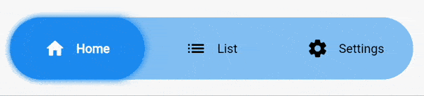
entries: const [
SegmentedButtonSlideEntry(
icon: Icons.home_rounded,
label: "Home",
),
SegmentedButtonSlideEntry(
icon: Icons.list_rounded,
label: "List",
),
SegmentedButtonSlideEntry(
icon: Icons.settings_rounded,
label: "Settings",
),
],
colors: SegmentedButtonSlideColors(
barColor: Theme.of(context).colorScheme.primaryContainer.withOpacity(0.5),
backgroundSelectedColor: Theme.of(context).colorScheme.primaryContainer,
),
slideShadow: [
BoxShadow(
color: Colors.blue.withOpacity(1),
blurRadius: 5,
spreadRadius: 1,
)
],
margin: const EdgeInsets.all(16),
height: 70,
padding: const EdgeInsets.all(16),
borderRadius: BorderRadius.circular(8),
selectedTextStyle: const TextStyle(
fontWeight: FontWeight.w700,
color: Colors.green,
),
unselectedTextStyle: const TextStyle(
fontWeight: FontWeight.w400,
color: Colors.red,
),
hoverTextStyle: const TextStyle(
color: Colors.orange,
),
),- [REQUIRED]
entriesaccepts a list ofSegmentedButtonSlideEntry. EachSegmentedButtonSlideEntryis formed by an icon and a label. You must declare at least one of the two. - [REQUIRED]
selectedEntryaccepts anint. Defines the item that's currently selected. - [REQUIRED]
onChangereturns the selected value when the user changes the selection. - [REQUIRED]
colorsaccepts an instance ofSegmentedButtonSlideColors. All of it's attributes are mandatory.barColordefines the background color of the full bar.backgroundSelectedColordefines the background color of the item that's currently selected.
slideShadowdefines the boxShadow of the slider (item that's currently selected).barShadowdefines the boxShadow of the full bar (the background).margincreates a margin around the whole widget.heightdefines the height of the widget.fontSizesets the fontSize of the text. It doesn't affect to the icon.iconSizesets the size of the icon. It doesn't affect to the text.textOverflowdefines how the text (only) should overflow.animationDurationdefines the duration of all the animations of the widget. By default it's set to 250 milliseconds.curvedefines the curve of all the animations of the widget. By default it's set toease.paddingdefines the distance between the selectable items and the outer container.borderRadiusdefines the border radius for the outer container and for the individual items.selectedTextStyleaccepts aTextStyleobject that defines the style for the icon and the text when the option is selected.unselectedTextStyleaccepts aTextStyleobject that defines the style for the icon and the text when the option is not selected.hoverTextStyleaccepts aTextStyleobject that defines the style for the icon and the text when the option is hovered.
Segmented button slide v2 includes some breaking changes.
foregroundSelectedColor,foregroundUnselectedColorandhoverColorhave been removed.- Now you can define that three colors with the
selectedTextStyle,unselectedTextStyleandhoverTextStyleattributes.