issue#26- Making the preview UI more attractive#59
Open
Gautam2305 wants to merge 10 commits intoPCON-Hacktoberfest-2022:mainfrom
Open
issue#26- Making the preview UI more attractive#59Gautam2305 wants to merge 10 commits intoPCON-Hacktoberfest-2022:mainfrom
Gautam2305 wants to merge 10 commits intoPCON-Hacktoberfest-2022:mainfrom
Conversation
 Gautam2305
commented
Gautam2305
commented
Oct 10, 2022
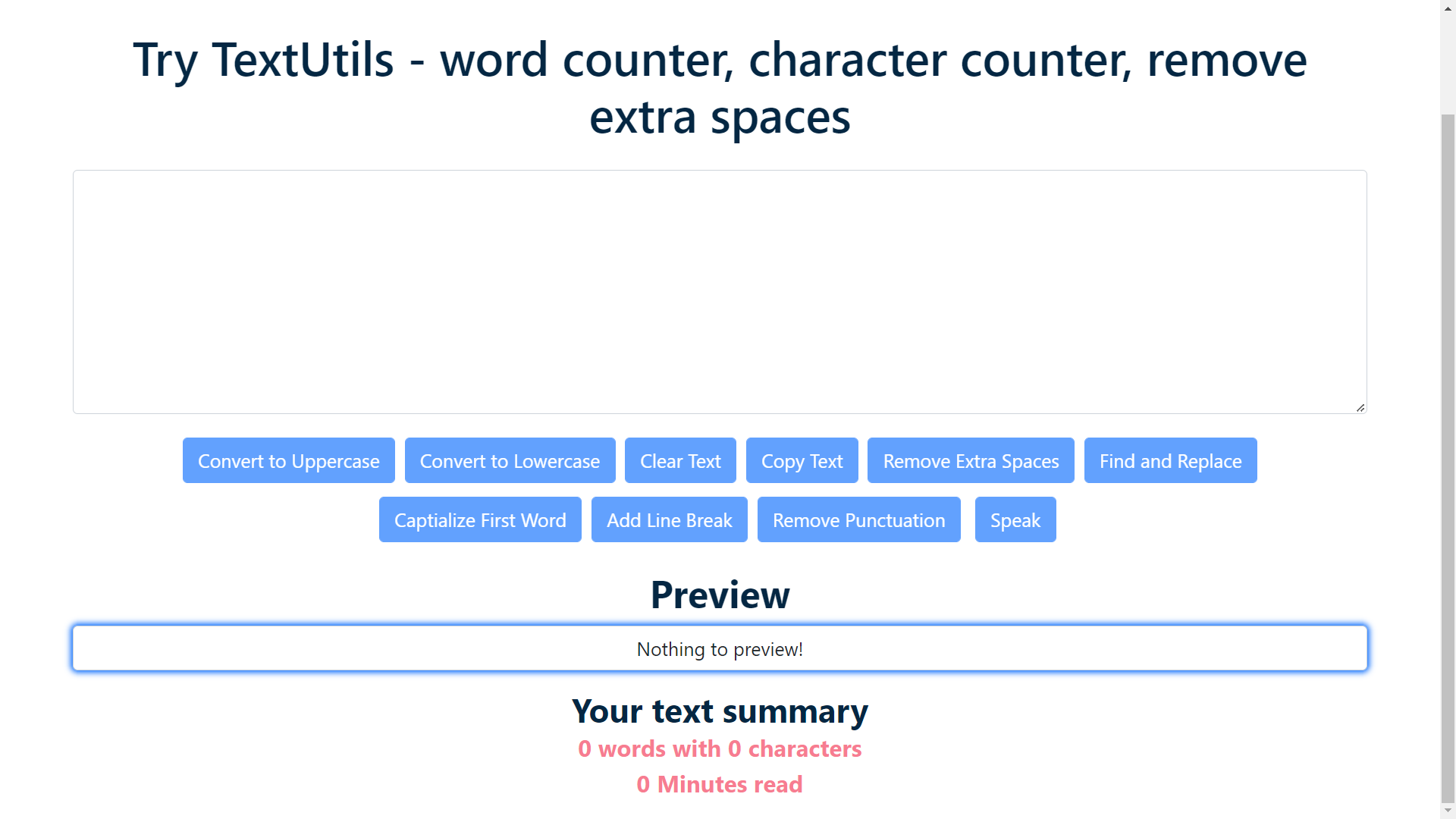
- Made the UI more interactive in the following way:
- Made the preview container stand out so that the user looks at it first by using box-shadows to highlight it differently from other buttons and containers.
- Used accent colors to highlight the summary i.e. number of words, characters and minutes taken to read which works well with the present colors in both light and dark mode.
- Moved the summary of the preview to the end of the page for better UX.
- Changed the heading texts size so that the user looks at the preview first rather than at the summary.
- Also moved the preview and the summary container to the center of the screen for better UX.
…ttractive

Issue#26 make preview UI more attractive
Collaborator
|
Resolve the conflict @Gautam2305 . Make sure to pull upstream before pushing ur changes. |
FIX: conflict with upstream
FIX: changed className attribute to class in TextForm
FIX: dependency versions
This file contains hidden or bidirectional Unicode text that may be interpreted or compiled differently than what appears below. To review, open the file in an editor that reveals hidden Unicode characters.
Learn more about bidirectional Unicode characters
Sign up for free
to join this conversation on GitHub.
Already have an account?
Sign in to comment
2 participants
Add this suggestion to a batch that can be applied as a single commit.This suggestion is invalid because no changes were made to the code.Suggestions cannot be applied while the pull request is closed.Suggestions cannot be applied while viewing a subset of changes.Only one suggestion per line can be applied in a batch.Add this suggestion to a batch that can be applied as a single commit.Applying suggestions on deleted lines is not supported.You must change the existing code in this line in order to create a valid suggestion.Outdated suggestions cannot be applied.This suggestion has been applied or marked resolved.Suggestions cannot be applied from pending reviews.Suggestions cannot be applied on multi-line comments.Suggestions cannot be applied while the pull request is queued to merge.Suggestion cannot be applied right now. Please check back later.