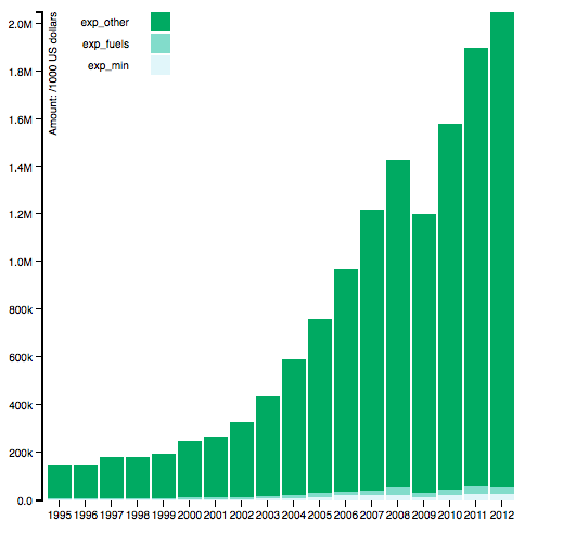
##Introduction In this repository, I am trying to explore the the exports reliance on resources exports. So we need to know the components of exports in each countries for each year. In this example I just visualize the data for China. If the export reliance on resources exports is very serious, then fuels exports and mineral exports will share a high percentage on the whole exports for one country. Through visualizing the data of exports, we can see the degree of exports reliance on resources.
I get the data source from the WDI and extract only the data about China of the export of fuels, export of mineral and the total exports for each year. The unit is thousand dollars. I firts draw the stack bar using these data. But I found that the bar is not very clear because the ratio of mineral export and fuel export against total export is very small. So even they are changing, we can really clearlly see it. So I add a pie graph to visualize the ratio so that we can clearly see the change of percentage of natural resource in all export in China.
This is the link of the new graph I've worked on. If the mouse is over one bar, then the pie graph next to the stack bar will display the data of that bar. the graph