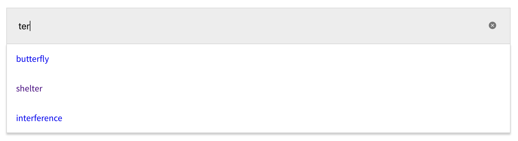
A React input component with pluggable search suggestions and autocomplete.
Also includes arrow key navigation through results.
- React (obviously)
yarn add react-input-suggestionsimport { InputSuggestions } from 'react-input-suggestions'
const MyComponent = () => (
<InputSuggestions
autoFocus
suggestions={[
'polite',
'fastidious',
'dull',
'pudding',
'mole',
'angle',
].map(word => (
<a href={`https://www.google.co.uk/search?q=${word}`}>{word}</a>
))}
/>
)
export default MyComponentThe markup is very simple. You bring what populates each search suggestion. In this example:
<div>
  <input />
  <ul>
    <li>
      <a href="https://www.google.co.uk/search?q=polite">polite</a>
    </li>
    <li>
      <a href="https://www.google.co.uk/search?q=fastidious">fastidious</a>
    </li>
    <li>
      <a href="https://www.google.co.uk/search?q=dull">dull</a>
    </li>
    <li>
      <a href="https://www.google.co.uk/search?q=pudding">pudding</a>
    </li>
    <li>
      <a href="https://www.google.co.uk/search?q=mole">mole</a>
    </li>
    <li>
      <a href="https://www.google.co.uk/search?q=angle">angle</a>
    </li>
  </ul>
</div>
If you wanted to do something else onClick or onKeyDown, you could do something like:
import { InputSuggestions } from 'react-input-suggestions'

const customFunction = (arg: string) => {
  console.log(arg)
}

const MyComponent = () => (
  <InputSuggestions
    autoFocus
    suggestions={[
      'polite',
      'fastidious',
      'dull',
      'pudding',
      'mole',
      'angle',
    ].map(word => (
      <span
        key={word}
        onKeyDown={e => {
          if (e.key === 'Enter') {
            customFunction(word)
          }
        }}
        onClick={() => {
          customFunction(word)
        }}
      >
        {word}
      </span>
    ))}
  />
)

export default MyComponent| Prop | Description | Type | Default | Required? |
|---|---|---|---|---|
suggestions |
A collection of HTML elements or React components used for search suggestions | React.ReactNode[] | Y | |
id |
ID for entire component | string | undefined |
N |
type |
Input type | 'search' | 'text' | 'search' |
N |
className |
Optional class name to style component | string | '' |
N |
name |
Input name | string | 'q' |
N |
placeholder |
Input placeholder | string | 'Search' |
N |
autoFocus |
Input autoFocus | boolean | false |
N |
onChange |
Input onChange handler | function | undefined |
N |
withStyles |
Basic styling for the component | boolean | false |
N |
highlightKeywords |
Highlight letters that match search term by wrapping a <mark> tag around suggestions |
boolean | false |
N |
By default, the component comes with almost no styles. Given the semantic nature of the markup, it is quite easy to target these with CSS. As mentioned above, you can provide a className to the component for this.
Alternatively, you can set the withStyles prop to true to achieve some very basic styling. An example of this can be seen on GitHub Pages.
Important: The :focus attribute on each top level element's search suggestion is what powers the active state of a selected element. Refer to the HTML Structure above to correctly determine any CSS selectors.
You get this functionality for free and was the main motivation for creating this shared component.