Conversation
| ['pill', undefined], | ||
| ['loading', undefined], | ||
| ] | ||
| }, |
There was a problem hiding this comment.
So the idea would be that we use this abstracted version of props and translate that into each framework implementation?
There was a problem hiding this comment.
IMO is OK if a framework deviates so it feels more native, but would be great to share names as much as possible so we can share descriptions and have a common API
Descriptions could be a separate object to support this, and we could change the props shape to support something like this:
const buttonDescriptions = {
  href: 'Will make the button an anchor tag and use this for href',
  disabled: 'Don't do this'
}

const vue = {
  button: {
     props: decoratePropsWithDescriptions({
       href: ['string', undefined]
     }, buttonDescriptions)
  }
}
| - A single experience for the user, and for the Fabric team to maintain | ||
| - Leaves the implementations to only worry about dev-playground sites instead of one/both | ||
| - React currently has both a docsite and storybook | ||
| - Vue has a combined approach |
There was a problem hiding this comment.
Agree with motivators 👍
 digitalsadhu
left a comment
digitalsadhu
left a comment
digitalsadhu
left a comment
There was a problem hiding this comment.
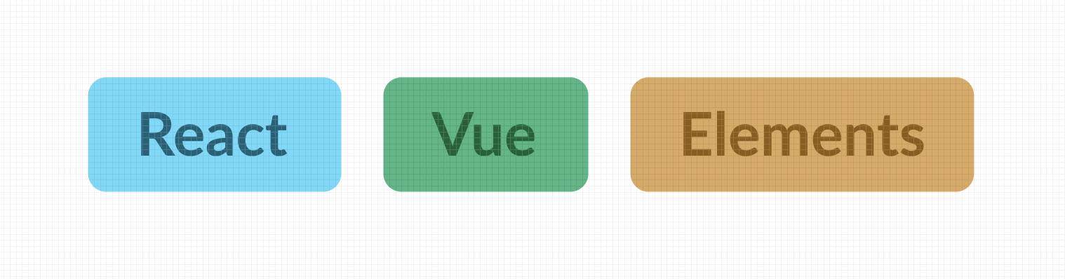
So do I understand correctly... we would keep the design and CSS docs as is and then merge Vue/React and Elements into a single entity?
|
IMO the CSS docs are 90% playground, so we could move the few sections that are actual docs/guides into this site |
ok, so keep design as is, merge all others into 1 "technical docs" site? |
|
Yup! |
|
Great writeup! I was under the impression that we wanted to go for a single sidebar entry and not splitting up between the frameworks, and showing different implementation levels like so:
Although that doesn't give away immediately what frameworks a component is supported in, so we could combine that approach with badges on top of the page for which JS-libs supports this component. E.g. something like this:
What are your thoughts on this approach? |
|
I don't think the suggestion/example from Vitepress is notably worse than that, just different. If we can get that UI "for free" from some other framework (and we don't lose any other features we want/need) and we want to go with that, I'm fine with that. (Because of how Vitepress manages the sidebar, I don't think we could do both Vitepress, and get its free intersection-observers, and do this tabbed approach) |
|
Why exactly do we want to meld together just the tech sites and not all of them including design site into 1? Tech reasons? |
|
@digitalsadhu or @benja would need to speak to that (whether that's a practical option). I would not be involved in implementing that change and am not familiar enough with Next to say. The framework I'm working with right now at least is pretty lightweight and gives us 99% of what we want for these docs (at least vs the requirements I've put above), I don't know if the design doc does the same. |
|
Thoughts on merging everything into 1 site: Advantages:
Disadvantages
Advantage 2 is super important, can we mitigate the disadvantages? Eg. Agree on a way to write docs/stuff in the individual repos that we then fetch automatically from the docs site. |
|
I'm on the fence on whether this is a better UX for developers, but I don't feel strongly about it so I'm happy to defer to y'all. I personally haven't referred to design docs/specs in the past few years while developing, they're usually different contexts for me. Worth also noting most design systems do not have unified docs. Not saying that means things one way or another, but the big boys aren't doing it and they definitely have more resources than we do. As long as you could fetch markdown as well as structured data like props I think it would be doable. There will definitely be concepts in each framework that require blocks of markdown that are different from the other framework(s) to detail. Also things like how to setup/install components is different between Vue/React, so it'd be important to have some flexibility. |
|
Starting to think we would do well to take a step back, schedule a planning meeting and figure this out. |
|
@digitalsadhu - sounds good to me! Also sounds like you just volunteered to set that meeting up! ;) |
I guess I did at that |
Documentation Planning Meeting 25/11/2021 14:00Notes:In summary, the group discussed optimal design and layout of a documentation site from a pretty high level. Highly specific discussion regarding technology stack etc. was not touched on in great detail. Goals@digitalsadhu suggested our main goals to be:
Design Documentation in Figma@benja made the suggestion that it might be easier to document design inside of Figma instead of in the documentation site itself. This idea seems to have merits but there is also a fairly strong sentiment that we should keep all documentation in one place. Previous Design Work@adidick showed some earlier designs where each component gets its own page with some up front initial information and a set of tabs underneath. 1 tab for design and 1 tab each for React, Vue, CSS and Elements. This seemed to be fairly well received as an approach and comes with the advantage that there is a single page for each component rather than a page for each component in each section. Tabbed DocumentationTrygve mentioned that in the Podium docs we use tabbed code examples for the various framework options and which this makes for a good user experience it can quickly become unwieldy to maintain. This could be perhaps avoided by pulling in readme docs from the repos themselves rather than try to maintain them in 1 documentation site. Accessibility@martin-storsletten raised 2 concerns:
DecisionsWe decided @adidick would try to prototype something for further discussion. Also a good idea to try to work out a common structure for technical docs TODOs:
|
|
We should probably keep things moving and move pretty quick on this so let's set a date for the 2 TODOs in the meeting writeup. |
|
Trying to think through what we want in the technical docs for the components...
|
|
Great starting point. I think a11y definitely should be a part of the component implementation / props structure. Some components require a bit more attention to a11y, such as the Card, if you wish to make it a clickable anchor card. So having the option to go quite in-depth is good. |
Thoughts from @pearofducks via Slack:
|
4 participants
Rendered: https://github.com/fabric-ds/issues/blob/tech-site/rfcs/0001-tech-site.md