Conversation
packages/combobox/src/component.tsx
Outdated
There was a problem hiding this comment.
Bottom padding seems to make the text not centered. Was that intended?
There was a problem hiding this comment.
Yes, I had to decide whether to fix that and make it inconsistent with the results list or to just keep it. I went with keep but could be persuaded otherwise..?
There was a problem hiding this comment.
I see. I thought the list also had some top padding for the first element but since it doesn't, your approach sounds reasonable :)
packages/combobox/src/props.ts
Outdated
There was a problem hiding this comment.
@digitalsadhu PR looks great! Can't wait for this feature :D
Just a small question about the feedback type, but it is maybe more of a question about design limitations, whether or not it could be a node instead of string.
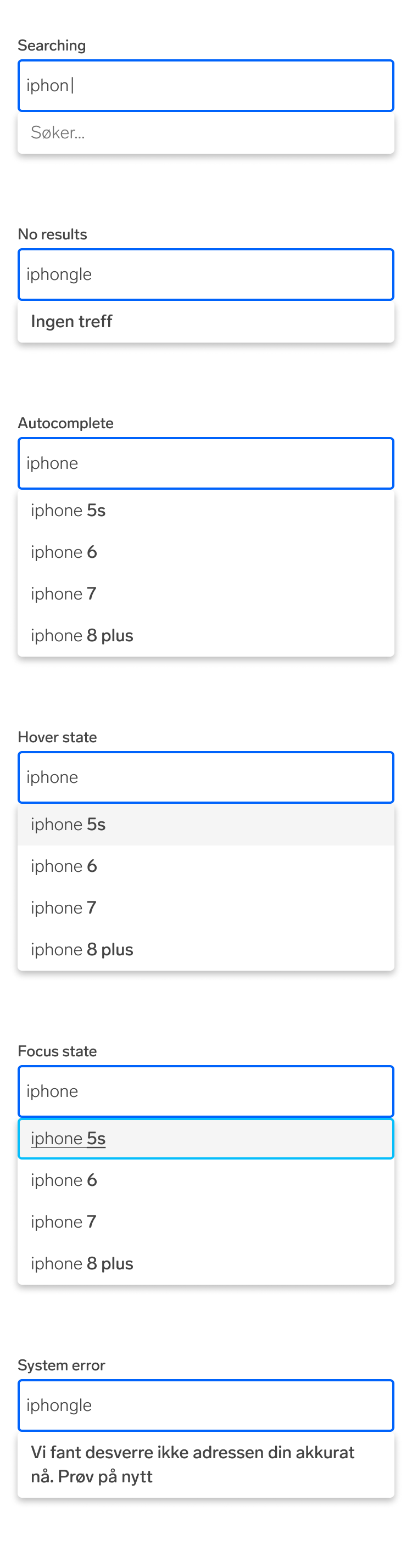
In our (TJTs) old troika-version I had some small styling differences between the different states. Like "søker" being italic and a little lighter in color for a more subtle feel, and then "ingen resultater" can grasp some more attention when it appears with a more heavy expression. (Keep in mind that these where design by me and not proper designers from the UI team :P )
It wasn't really much, just some small differences to help the user know what is just buzzing in the background and when an actual change happened. But I also think it is fair to discuss if it is worth the tradeoff it would be to allow "anything" in the feedback prop instead of a string.
I was thinking of tagging Adi, but not sure if he is on Github
There was a problem hiding this comment.
I could certainly look at making this take a ReactNode instead of a string. I wonder if we should though. Be good for consistency if the styling of the text was determined by UX/UI maybe. Thoughts @adidick ?
There was a problem hiding this comment.
@martinetruls (or anyone else) Do you have maybe some screenshots or a video of all of the different states? If so I can take a look at the design and maybe create some components for our Figma library with the variants to help standardise this.
There was a problem hiding this comment.
I think there were some examples in this thread: https://sch-chat.slack.com/archives/C01GYKPJVFT/p1663321810240169
There was a problem hiding this comment.
Yes, thanks Balbina! :) (I was out of office today)
There was a problem hiding this comment.
@adidick is this something you'd be likely to find time for soon or should we push forward with an interim solution? If the latter, I'll make @martinetruls request to make feedback more flexible and we can make further changes in a later iteration.
|
|
|
|
Urrrg, apologies, I had a very old version of this thread open in my browser so didn't see the latest discussions until after I'd submitted my comment. |
|
Looking through the screenshots above I think we should remove the |
|
I played around with this a bit and in the end landed on splitting the feedback prop into 3 levels. Info, warn and error. (See changes to the PR now) Unsure if this is the best way to go, happy to get some feedback here. Thoughts @martinetruls @BalbinaK ? |
| {feedbackWarn && ( | ||
| <div className="absolute pb-8 left-0 right-0 bg-primary rounded-8 bg-white shadow"> | ||
| <div id="static-text" className="block p-8 font-bold"> | ||
| {feedbackWarn} | ||
| </div> | ||
| </div> | ||
| )} | ||
| {feedbackError && ( | ||
| <div className="absolute pb-8 left-0 right-0 bg-primary rounded-8 bg-white shadow"> | ||
| <div id="static-text" className="block p-8 font-bold"> | ||
| {feedbackError} | ||
| </div> | ||
| </div> | ||
| )} |
There was a problem hiding this comment.
Do we need to have two different props if they end up with the same style?
There was a problem hiding this comment.
I'm honestly pretty unsure. They seemed like 3 distinct use cases even though they look the same so I leaned toward keeping them semantically different. We could go for something that leans more into the category of style instead of a "level" approach. Eg. light and heavy or something.
There was a problem hiding this comment.
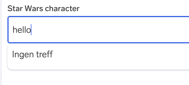
could we go with "subtle" (as seen in "Søker...") and "emphasis" (as seen in "Ingen treff")?
| feedbackInfo="Søker..." | ||
| feedbackWarning="Ingen treff" | ||
| feedbackError="Vi fant desverre ikke adressen din akkurat nå. Prov på nytt" |
There was a problem hiding this comment.
Just wondering what you think about having a feedback prop that accepts a text string and feedbackType prop that accepts FeedbackType, e.g. "info" | "warning" (we can default to one that makes most sense). This would give us freedom to handle more feedback styles without adding more props or making breaking changes.
<Combobox
  ...
  feedback="Søker..."
  feedbackType="info"
/>
We could also try typing feedback as feedback?: { text: string; type?: "info" | "warning" } to not add more props to an already complex Combobox.
What do you think?
There was a problem hiding this comment.
I considered this and am happy to be persuaded that this is the better way to go. The whole thing is a bit awkward generally as you need to juggle more than 1 property when changing the feedback message during an async operation such as a search.
There was a problem hiding this comment.
Hm. I guess you'd still need to change 2 properties, i.e. resetting the one that was there before and setting a new one.
There was a problem hiding this comment.
<Combobox
  ...
  feedback="Søker..."
  feedbackStyle="subtle"
/><Combobox
...
feedback="Ingen treff"
feedbackStyle="emphasis"
/>Or we could lean into React's ability to take objects as props and do something like this:
<Combobox
  ...
  feedback={ message: "Ingen treff", style: "subtle" }
/>
??
There was a problem hiding this comment.
Is there a reason why we can't go with light & bold? I'm just wondering if users will understand what emphasis and subtle entail without testing them first.
There was a problem hiding this comment.
I think this discussion is quite related to what @martin-storsletten has to say regards accessibility. If they should include some semantics it won't be sufficient to use style ad an indicator.
There was a problem hiding this comment.
My only concern with "light" and "bold" is that its highly coupled to how the styling is meaning if we change the styling, we might then need to change the name of the props. That said, that may not be very likely at all and light and bold may be easy to understand.
| </div> | ||
| </div> | ||
| )} | ||
| {feedbackError && ( |
There was a problem hiding this comment.
Is this sufficient for screen readers, or does it need some aria attributes to highlight the error?
There was a problem hiding this comment.
Might also depend on whether this is actually an error. I might be off base with that. Perhaps its just emphasised feedback text.
|
Do we have any progress here? |
4 participants
Fixes fabric-ds/issues#106
What do we think of this approach? Should I have implemented this differently? If so, what would be better?