- Download the HTML and images (click this link to download)
- You are going to write the CSS for this page
- You are not allowed to change the HTML
- The page contains two grids: the first one should work using floats, the second using flexbox. Be careful not to mix the two!
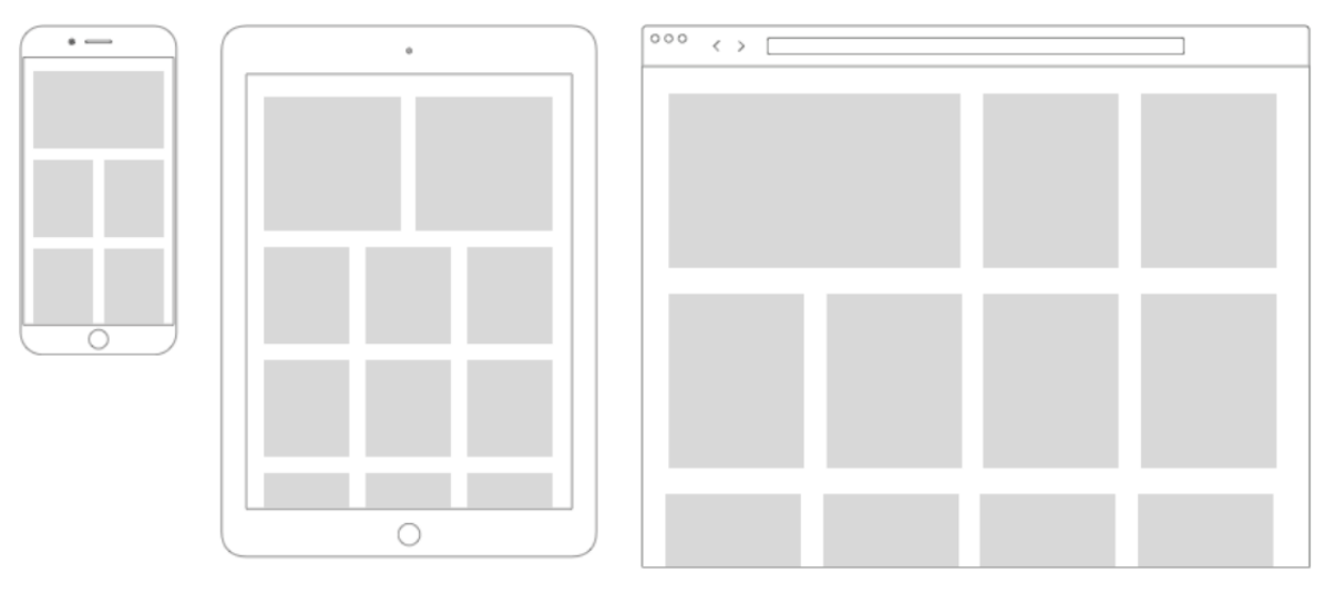
- We want the grid to look as follows (check the wireframe below):
- On mobile phones (browser width up to
768px): a two column grid, with the exception that the first item spans the full width - On tablets (browser width between
769pxand1023px): a three column grid, with the exception that the first two items span the full width together (so first we have two columns, then after the first two items we have three columns) - On desktops (browser width greater than or equal to
1024px): a four column grid, with the exception that the first item spans two columns.
- On mobile phones (browser width up to
- There should be some space between the grid items
- Make the page look beautiful by adding some more CSS! Some tips:
- How about some nice colors, fonts?
- According to the grid specification, some products are bigger than others. Maybe these are "highlighted" products, so the rest of the styling could also be different.
- Read the style guide and check your files