نور - "Light" in Arabic
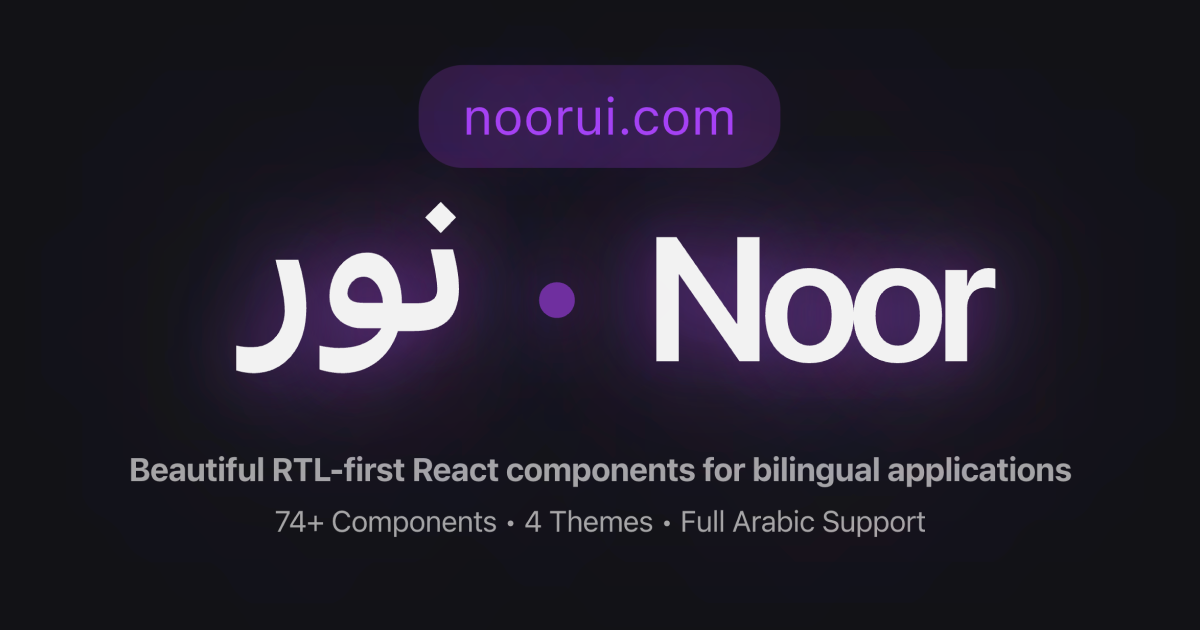
Beautiful RTL-first React components for bilingual applications. Built with Radix UI, Tailwind CSS, and full Arabic/English support.
Documentation · Examples · npm
- 🌍 RTL-First: Perfect Arabic/Persian support with logical properties
- 🎨 74+ Components: Complete UI toolkit for modern applications
- ♿ Accessible: WCAG AA compliant with full keyboard navigation
- 🎯 TypeScript: Full type safety and IntelliSense support
- 🎭 Themeable: Light/dark mode with customizable design tokens
- 🕌 GCC-Specific: Prayer times, Hijri calendar, Arabic numbers, Zakat calculator
- ⚡ Modern Stack: Next.js 15, React 19, Tailwind CSS, Radix UI
- 📦 Tree-shakeable: Only bundle what you use
npm install noorui-rtl
# or
yarn add noorui-rtl
# or
pnpm add noorui-rtlnpm install noorui-rtlOption A: Pre-compiled CSS (Recommended - No Tailwind setup needed)
Import the pre-compiled CSS in your root layout or app entry point:
// app/layout.tsx or _app.tsx
import 'noorui-rtl/dist/styles.css'
This includes all component styles, CSS variables, theme definitions, and RTL support. No Tailwind configuration required!
Option B: Tailwind Configuration (For custom Tailwind setups)
If you're already using Tailwind and want to customize the configuration:
- Update your
tailwind.config.ts:
import type { Config } from 'tailwindcss'

const config: Config = {
  content: [
    './app/**/*.{js,ts,jsx,tsx,mdx}',
    './components/**/*.{js,ts,jsx,tsx,mdx}',
    // Add noorui-rtl components
    './node_modules/noorui-rtl/**/*.{js,ts,jsx,tsx}',
  ],
  theme: {
    extend: {},
  },
  plugins: [],
}

export default config- Add CSS variables to
globals.css:
@tailwind base;
@tailwind components;
@tailwind utilities;

@layer base {
  :root {
    --background: 0 0% 100%;
    --foreground: 222.2 84% 4.9%;
    --card: 0 0% 100%;
    --card-foreground: 222.2 84% 4.9%;
    --popover: 0 0% 100%;
    --popover-foreground: 222.2 84% 4.9%;
    --primary: 222.2 47.4% 11.2%;
    --primary-foreground: 210 40% 98%;
    --secondary: 210 40% 96.1%;
    --secondary-foreground: 222.2 47.4% 11.2%;
    --muted: 210 40% 96.1%;
    --muted-foreground: 215.4 16.3% 46.9%;
    --accent: 210 40% 96.1%;
    --accent-foreground: 222.2 47.4% 11.2%;
    --destructive: 0 84.2% 60.2%;
    --destructive-foreground: 210 40% 98%;
    --border: 214.3 31.8% 91.4%;
    --input: 214.3 31.8% 91.4%;
    --ring: 222.2 84% 4.9%;
    --radius: 0.5rem;
  }

  .dark {
    --background: 222.2 84% 4.9%;
    --foreground: 210 40% 98%;
    /* ... rest of dark mode variables */
  }
}Add the theme and direction providers to enable all features:
import { ThemeProvider } from 'next-themes'
import { DirectionProvider, DesignSystemProvider } from 'noorui-rtl'

export default function RootLayout({ children }) {
  return (
    <html>
      <body>
        <ThemeProvider attribute="class" enableSystem={true}>
          <DirectionProvider>
            <DesignSystemProvider defaultTheme="cozy">
              {children}
            </DesignSystemProvider>
          </DirectionProvider>
        </ThemeProvider>
      </body>
    </html>
  )
}
What each provider does:
ThemeProvider(next-themes): Light/Dark mode with system preference supportDirectionProvider: RTL/LTR direction and locale switching (ar/en)DesignSystemProvider: Design theme variants (minimal/futuristic/cozy/artistic)
Switching themes programmatically:
import { useDesignSystem } from 'noorui-rtl'
import { useTheme } from 'next-themes'
import { useDirection } from 'noorui-rtl'

function Settings() {
  const { designTheme, setDesignTheme } = useDesignSystem()
  const { theme, setTheme } = useTheme()
  const { direction, setDirection } = useDirection()

  return (
    <div>
      {/* Design theme */}
      <select value={designTheme} onChange={(e) => setDesignTheme(e.target.value)}>
        <option value="minimal">Minimal</option>
        <option value="futuristic">Futuristic</option>
        <option value="cozy">Cozy</option>
        <option value="artistic">Artistic</option>
      </select>

      {/* Light/Dark mode */}
      <button onClick={() => setTheme(theme === 'dark' ? 'light' : 'dark')}>
        Toggle {theme === 'dark' ? 'Light' : 'Dark'} Mode
      </button>

      {/* Direction */}
      <button onClick={() => setDirection(direction === 'rtl' ? 'ltr' : 'rtl')}>
        Switch to {direction === 'rtl' ? 'LTR' : 'RTL'}
      </button>
    </div>
  )
}import { Button, Card, CardHeader, CardTitle, CardContent } from 'noorui-rtl'
export default function App() {
return (
<Card>
<CardHeader>
<CardTitle>Welcome to Noor UI</CardTitle>
</CardHeader>
<CardContent>
<Button>Get Started</Button>
</CardContent>
</Card>
)
}Forms: Button, Input, Label, Textarea, Checkbox, Radio, Select, Switch, Slider, Form
Layout: Card, Separator, Tabs, Accordion, Collapsible
Navigation: Breadcrumb, Pagination, Command
Feedback: Alert, Toast, Progress, Skeleton, Badge, Avatar, Loading Spinner
Overlays: Dialog, Sheet, Popover, Tooltip, Dropdown Menu, Context Menu
Data: Table, DataTable, Stats Card, Feature Card, Empty State, Listing Card
Advanced: File Upload, Rich Text Editor, Date Picker, Time Picker, Number Input, Dashboard Shell, User Menu, Notification Center, Stepper
- Prayer Times: Display Islamic prayer times with countdown and Adhan notifications
- Hijri Date: Dual Gregorian/Hijri calendar display
- Arabic Number: Arabic-Indic numeral utilities and SAR currency formatting
- Zakat Calculator: Calculate Islamic Zakat with export/sharing
- Calendar: Date picker with Hijri support and event markers
Chat Message, Streaming Text, Prompt Input, Thinking Indicator, Message Actions, Model Selector, Parameter Slider, Token Counter, Conversation History, Workflow Canvas
Note: AI/LLM components are functional but APIs may evolve based on feedback.
All components support RTL out of the box:
'use client'

import { useState } from 'react'
import { Button, Tabs, TabsList, TabsTrigger } from 'noorui-rtl'

export default function App() {
  const [direction, setDirection] = useState<'ltr' | 'rtl'>('ltr')

  return (
    <div dir={direction}>
      <Button onClick={() => setDirection(d => d === 'ltr' ? 'rtl' : 'ltr')}>
        Toggle Direction
      </Button>

      <Tabs defaultValue="tab1">
        <TabsList>
          <TabsTrigger value="tab1">Tab 1</TabsTrigger>
          <TabsTrigger value="tab2">Tab 2</TabsTrigger>
        </TabsList>
      </Tabs>
    </div>
  )
}
Components automatically adapt to text direction using logical properties.
For advanced features like direction context:
import { DirectionProvider, useDirection } from 'noorui-rtl'

function App() {
  return (
    <DirectionProvider>
      <YourApp />
    </DirectionProvider>
  )
}

function YourComponent() {
  const { direction, setDirection, locale } = useDirection()

  return (
    <button onClick={() => setDirection(direction === 'ltr' ? 'rtl' : 'ltr')}>
      Current: {direction}
    </button>
  )
}Full documentation, examples, and guides available at noorui.com
Contributions are welcome! Please read our Contributing Guide.
MIT License - see LICENSE
Built with:
- Radix UI - Accessible component primitives
- Tailwind CSS - Utility-first CSS framework
- Lucide React - Beautiful icons
- Next.js - React framework
- 💬 Discord: Join our community
- 📧 Email: info@ositaka.com
- 🐛 Issues: GitHub Issues
- 💬 Discussions: GitHub Discussions
- 🌐 Website: noorui.com
If you find Noor UI helpful, please give it a ⭐️ on GitHub!
Built with ❤️ for the GCC market by Nuno Marques