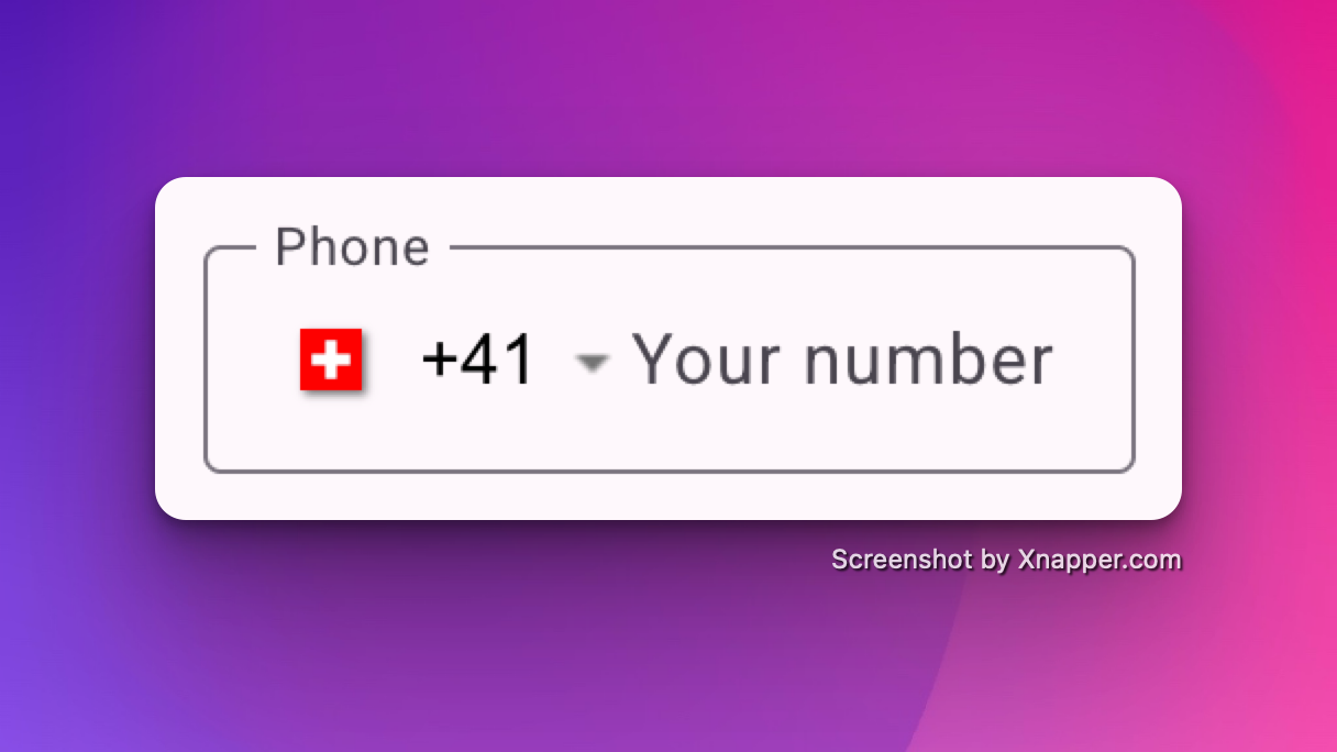
An Angular Material package for entering and validating international telephone numbers. It adds a flag dropdown to any input, detects the user's country, displays a relevant placeholder and provides formatting/validation methods.
This is a fork from the ngx-mat-intl-tel-input library whish is not maintained anymore.
Supports:
| Angular | ngx-mat-input-tel |
|---|---|
| >= 18 | >= 19.2.0 |
| >= 15 | < 19.2.0 |
- Validation with libphonenumber-js
$ npm i ngx-mat-input-tel@latest
$ npm i libphonenumber-js@latest
Add NgxMatInputTelComponent to your component file:
imports: [NgxMatInputTelComponent]Refer to main app in this repository for working example.
<form #f="ngForm" [formGroup]="phoneForm">
  <ngx-mat-input-tel
    [preferredCountries]="['us', 'gb']"
    [enablePlaceholder]="true"
    [enableSearch]="true"
    name="phone"
    describedBy="phoneInput"
    formControlName="phone"
  ></ngx-mat-input-tel>
</form><form #f="ngForm" [formGroup]="phoneForm">
<ngx-mat-input-tel
[preferredCountries]="['US', 'GB']"
[enablePlaceholder]="true"
[enableSearch]="true"
name="phone"
autocomplete="tel"
(countryChanged)="yourComponentMethodToTreatyCountryChangedEvent($event)" // $event is a instance of current select Country
formControlName="phone"></ngx-mat-input-tel>
</form>If you want to show the sample number for the country selected or errors , use mat-hint anf mat-error as
<form #f="ngForm" [formGroup]="phoneForm">
  <ngx-mat-input-tel
    [preferredCountries]="['US', 'GB']"
    [onlyCountries]="['US', 'GB', 'ES']"
    [enablePlaceholder]="true"
    name="phone"
    autocomplete="tel"
    formControlName="phone"
    #phone
  ></ngx-mat-input-tel>
  <mat-hint>e.g. {{phone.$selectedCountry().placeholder}}</mat-hint>
  <mat-error *ngIf="f.form.controls['phone']?.errors?.required">Required Field</mat-error>
  <mat-error *ngIf="f.form.controls['phone']?.errors?.validatePhoneNumber"
    >Invalid Number</mat-error
  >
</form>| Options | Type | Default | Description |
|---|---|---|---|
| ariaLabel | string |
Select country |
Aria label for the country selector button |
| autocomplete | off | tel |
off |
For input autocompletion |
| cssClass | string |
undefined |
If input custom class are needed |
| countriesName | Record<string, string> |
COUNTRIES_NAME |
For using different country names in the dropdown (Eg. Multilingual website) |
| defaultCountry | CountryCode |
undefined |
Default country code |
| enablePlaceholder | boolean |
false |
Input placeholder text, which adapts to the country selected. |
| enableSearch | boolean |
false |
Whether to display a search bar to help filter down the list of countries |
| format | string **** |
default |
Format of "as you type" input. Possible values: national, international, default |
| hideAreaCodes | boolean |
false |
Hide the Area codes in the country dropdown selection |
| maxLength | number |
15 |
max length of the input. |
| onlyCountries | string[] |
[] |
List of manually selected country abbreviations, which will appear in the dropdown. |
| placeholder | string |
undefined |
Placeholder for the input component. |
| preferredCountries | string[] |
[] |
List of country abbreviations, which will appear at the top. |
| resetOnChange | boolean |
false |
Reset input on country change |
| searchPlaceholder | string |
Search ... |
Placeholder for the search input |
| validation | isPossible | isValid |
isValid |
Change the validation type |
| separateDialCode | boolean |
false |
Whether to separate the dial code from the input Note: you'll have to manually add margin-left to your input |
| Options | Type | Default | Description |
|---|---|---|---|
| countryChanged | EventEmitter<Country> |
undefined |
On country change |
| Name | Default | Explanation |
|---|---|---|
--ngxMatInputTel-opacity |
0 |
If you wish both, the country flag and the placeholder to be shown by default |
--ngxMatInputTel-selector-opacity |
0 |
If you wish the country flag to be shown by default |
--ngxMatInputTel-placeholder-opacity |
0 |
If you wish the placeholder flag to be shown by default |
--ngxMatInputTel-flag-display |
inline-block |
If you wish to hide the country flag |
--ngxMatInputTel-menu-flag-display |
inline-block |
If you wish to hide the country flag inside the menu only |
--ngxMatInputTel-gap |
32px |
If you wish to change the gap between the flag and the input field (Only works with separateDialCode) |
In case you had to manually remove the validator, the library exported it so you could add it back again.
| Name | Description | Example |
|---|---|---|
ngxMatInputTelValidator |
The actual phone validator used for the control | phoneControl.addValidators([ngxMatInputTlValidator]) |
- Fork repo.
- Go to
./projects/ngx-mat-input-tel - Update
./src/libwith new functionality. - Update README.md
- Pull request.
- Build lib:
$ npm run build_lib - Copy license and readme files:
$ npm run copy-files - Create package:
$ npm run npm_pack - Build lib and create package:
$ npm run package
After building and creating package, you can use it locally too.
In your project run:
$ npm install --save {{path to your local '*.tgz' package file}}
- maintainer Raphaël Balet
- Forked from ngx-mat-intl-tel-input
Contributions are welcome! See our contribution notes.


