**Assignment 2 - Data Visualization, 5 Ways
**
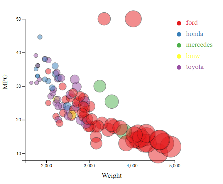
For this assignment, I created the graph in 4 coding languages and in one other program (excel). The four coding languages I used were R (ggplot2), matlab, python (matplotlib, pandas, & numpy), and d3. I was not able to successfully accomplish everything for all 5 charts but most were similar if not achieving some parts of the extra additions of grid lines or the legend.
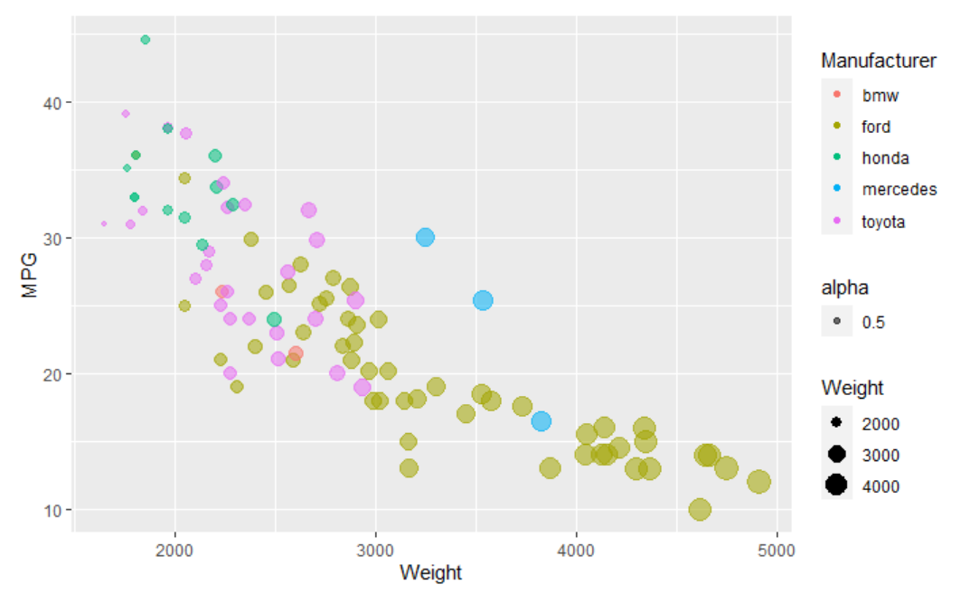
#1: R - ggplot2 R is a programming language often used for statistical programming and graphics. It has ggplot2, which helps break up graphs and have better and easily made graphics. The way to start making this graph was demonstrated in class and I utilized the code from class, adding to this class code to add the additional missing pieces, like the color and opacity working properly. This chart was able to replicate what was exemplified, as it is made from the same language as the original photo. I was able to successfully able to format those few additions.
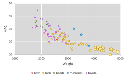
#2: Excel Excel is a spreadsheet created by Microsoft tht is able to take data and create charts. In this, I used a scatterplot to create the chart, using the data we had and creating additional extra rows to ensure the Manufacturer color was being calculated correctly. This graph was created and I tried my best to keep the colors similar to the original ones for the different manufacturers. I also had the gridlines and the legend for the manufacturers on this graph. The main issue I had with this one was that I struggled to change the size based on the data and ended up having to manually change them to accurately reflect the differences in weight. There was also a limitation were I could not change where the axis started without messing up the ticks and went as close as possible to the original (10 to 50 on the y axis and 1000 to 5000 on the x axis).
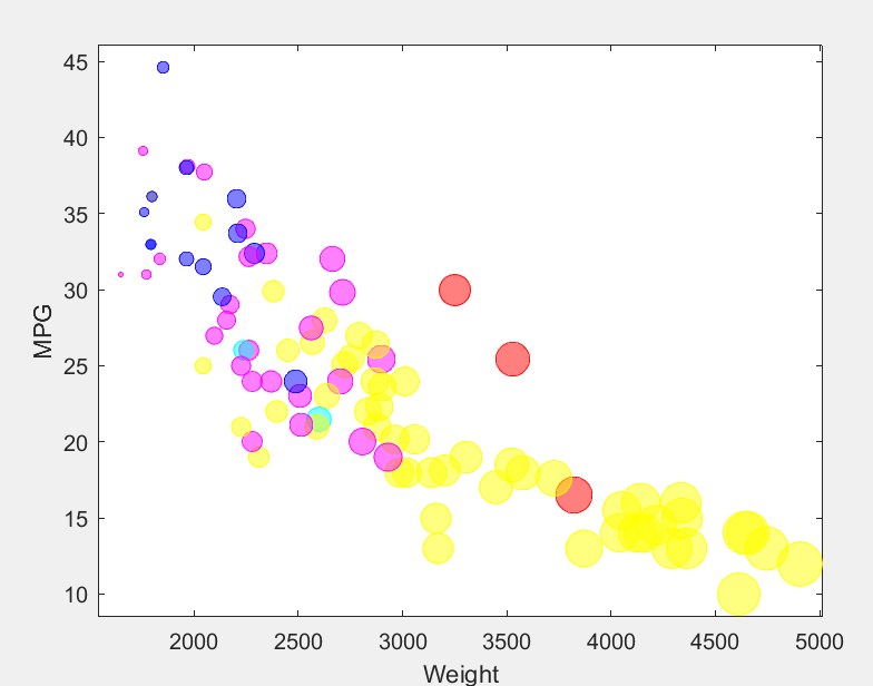
#3: Matlab Matlab is a matrix based coding languages that is able to accurately make graphs. I used this because I have used matlab before and wanted to have some practice. I had not made a bubblechart in matlab before though and had to do some research. However, I was able to successfully make the chart. It is lacking a legend but the colors were attempted to be similar and for the bubble sizes to be of a similar size. The biggest issue I had with Matlab was actually opening the csv file I had attempted to. I had to change how I had planned to approach it and while changing it could not get the cell array to be altered to be colors instead of the manufacturer. Because it was so problematic, I ended up manually inputting the colors in their own array that would be used to determine te color.
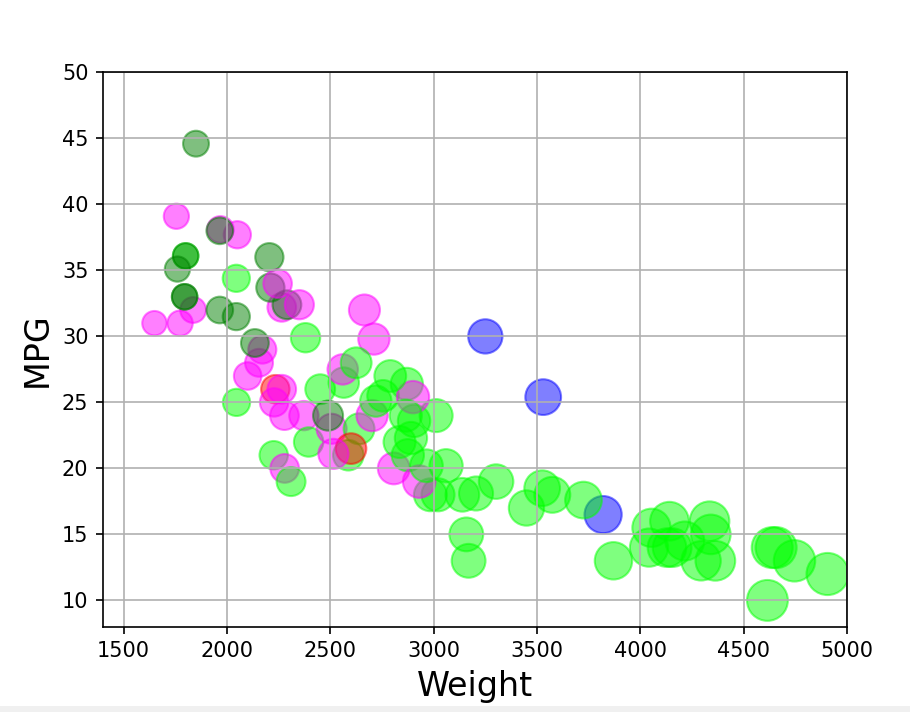
#4: Python - matplotlib Python matplotlib is used to create visualizations in python. Matplotlib was used here to create the bubblechart and did not have many issues. The axises do start at the right locations, but there are too many ticks on the lines. The bubbles are all done properly and the colors were attempted to be similar to d3. A series of if statements had to be used to create a list of the proper colors because it would not directly turn the manufacturer to a specific color. This was in general one of the easier ones for me to accomplish because I have used python more recently that most of the other coding languages I used. To figure out how to make a bubblechart I referenced: https://datavizpyr.com/make-bubble-plot-in-python-with-matplotlib/ and to use a csv for data in a graph I referenced: https://matplotlib.org/stable/tutorials/introductory/pyplot.html
#5: d3
d3 is the main open source we have been using for this class. d3 is still very confusing to me and while I am trying to learn, it definitely is a bit of a learning curve and confusing to wrap my head around it. For the d3 code, I found a more advanced coding option and typed up the parts that I needed to create the graph successfully. There is a legend for the manufacturers. I had trouble with the colors and keeping them more similar because they were randomized and when I moved the manufacturer names around they became different colors but not consistently the color I was looking for. The code was majorly based off of: https://www.d3-graph-gallery.com/graph/bubble_template.html
Technical Achievements
- I was able to learn more about graphing in multiple languages that I did not know already. I have minimal experience in coding graphs in any languages, so I think this was very valuable to learn more.
- While I did not include them in my d3 work, I was able to see different interactions that could be by referencing the code I found for d3. I did not use them but they were interesting to interact with. One feature, highlight, would just hide the graph data if the mouse was drawn over the legend, which was odd.
- I also was able to add the grid to a couple of the graphs to practice another attribute addition.
Design Achievements
- I was able to create similar bubble sizes and colors for all of the charts (although not exactly the same). The similar colors and sizes allow for easier comparison between the different graphs that have been conducted.